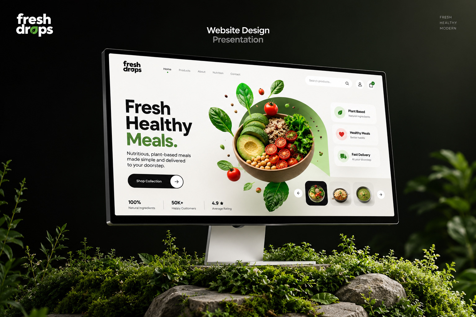
Retail Packaging Range
01 / Packaging
Fresh Thinking, Better Living: An invigorating brand identity and sustainable packaging system created for Fresh Drops. Built to redefine wellness hydration with vibrant clarity, honest ingredients, and distinctive retail presence.
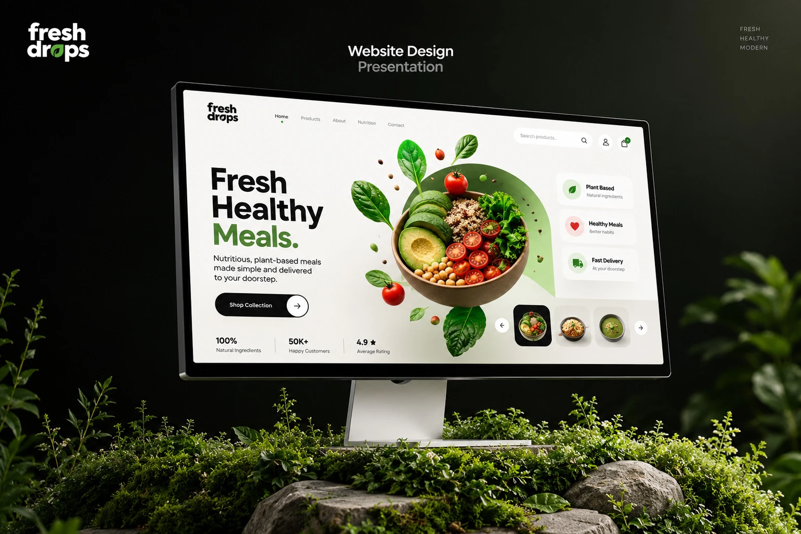
The wellness drink and functional beverage market is flooded with clinical, over-engineered labels that feel cold and uninviting.
Fresh Drops wanted to champion an uplifting philosophy: that healthy living should be pure, joyful, and completely accessible. The challenge was to forge a visual identity that felt undeniably clean and natural while commanding immediate eye-contact on competitive supermarket shelves and digital e-commerce storefronts.
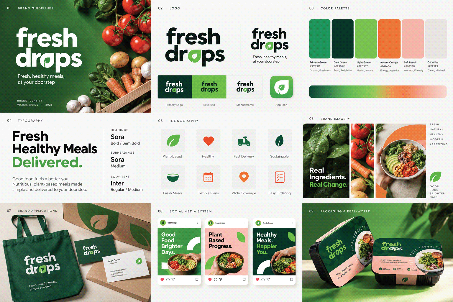
The brand symbol originates from the convergence of a fresh water droplet and an unfurling botanical leaf.
A harmonious mark combining liquid fluidity with natural botanical growth, symbolizing clean renewal and vitality.
Minimalist label architecture with prominent botanical illustrations, transparent ingredient callouts, and matte-finish tactile varnish.
Zesty citrus hues, lush botanical greens, and crisp neutral whites creating an instant visual burst of freshness across all flavor lines.
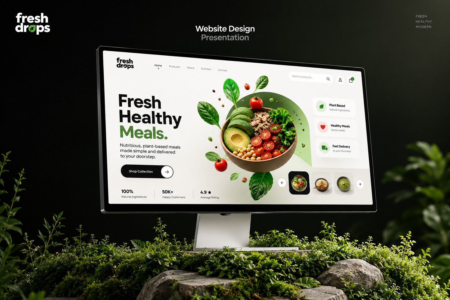
Fresh Drops launched with immediate shelf velocity, securing placement across 120+ organic grocers and retail locations within its initial quarter.
The clean typographic hierarchy and distinctive color coding empowered consumers to easily identify their preferred functional blend, resulting in a 42% repeat purchase rate and enthusiastic social media engagement.