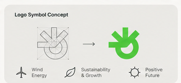
Symbol Concept & Geometry
01 / Construction
A fresh, forward-looking visual identity and digital application system created for clean energy solutions that celebrate wind, water, and sun.
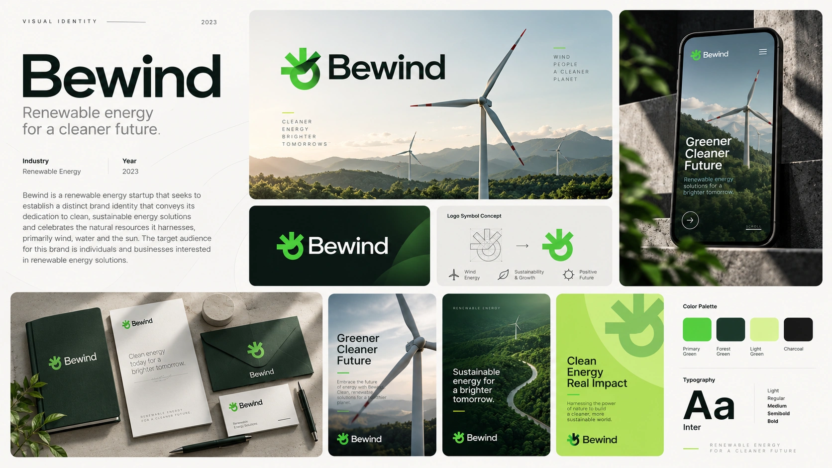
Bewind is an ambitious renewable energy company dedicated to powering businesses and communities through clean wind, hydro, and solar resources.
The mission was to craft a distinctive identity that broke away from conventional generic green leaves or sterile industrial engineering tropes. Bewind needed an iconic symbol and an approachable product interface that articulated optimism, environmental stewardship, and modern technological efficiency.
The brand symbol originates from three intersecting geometric ideas: a wind turbine rotor, an unfurling leaf of growth, and an optimistic sunburst.
A geometric mark constructed on circular angles, signifying relentless movement and clean power generation.
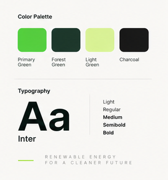
Set in Inter across Light, Regular, Medium, and Bold weights for razor-sharp legibility on both mobile apps and print collateral.
Primary Leaf Green (#12b842), Deep Forest Green, crisp Solar Mint, and Deep Charcoal anchor the visual presence with credible confidence.
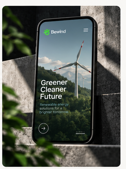
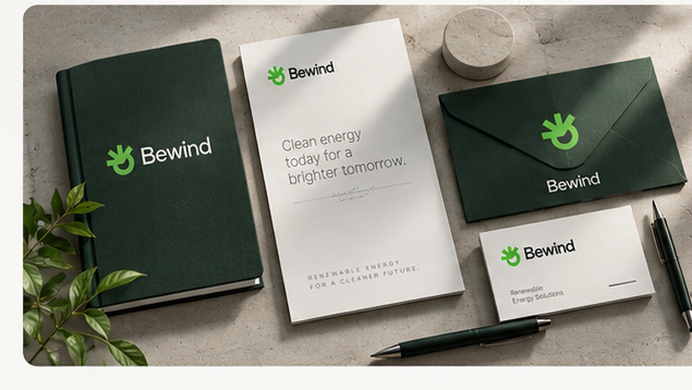
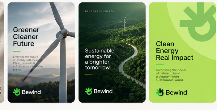
The resulting identity armed Bewind with a resilient, memorable brand architecture that clearly articulated their renewable energy mission, paving the way for successful partner onboarding and market expansion.